Colour trends in 2021 and their use in office interiors
Colour is one of the fundamental and key tools of interior designers. But it is not a rigid tool that remains the same in every situation. On the contrary. The use of colour is constantly evolving, led by new discoveries in the field of psychology.
Companies that want to provide employees with an environment that inspires creativity and productivity must not underestimate the colour scheme of the interior. In addition to psychologists and architects, major design companies also deal with colour. Every year, they set trends that affect fashion, the appearance of various products and, of course, interior design. Let's see what colours experts say await us in 2021 and how we can apply them in the office.
This year's colours
Pantone colour of the year 2021: Ultimate Grey and Illuminating Yellow
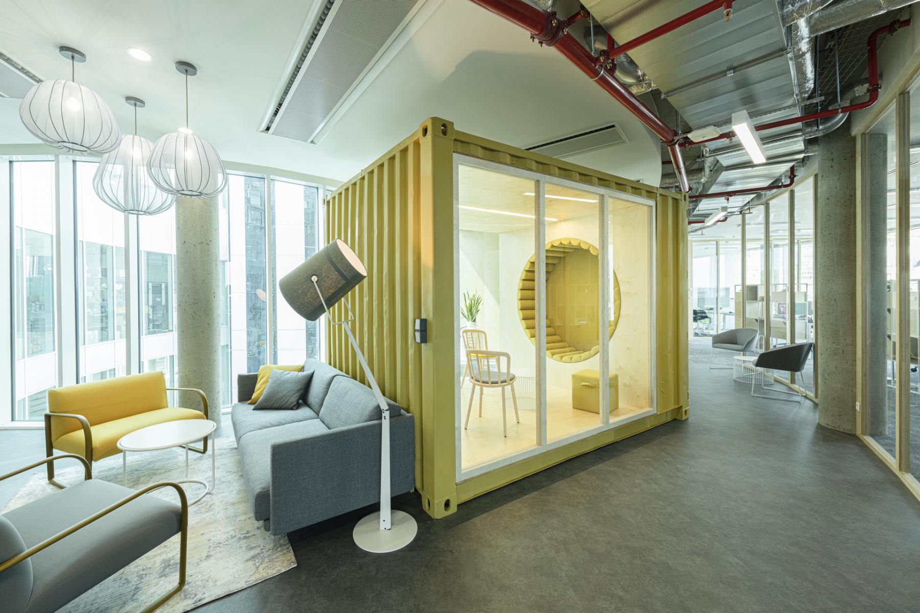
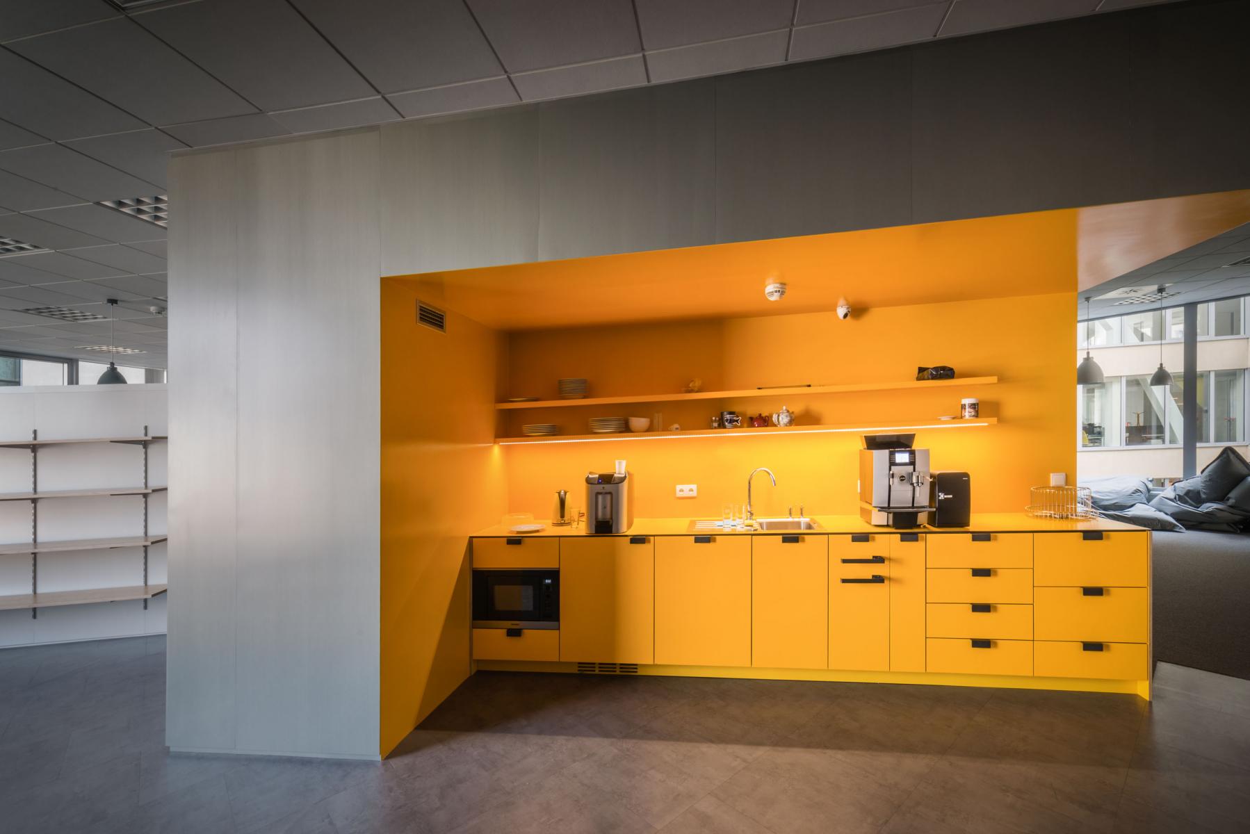
The Pantone Colour Institute in America is the world's most recognized authority on colour and has announced a major colour trend each year for the past 20 years. According to experts from Pantone, this year we will see a combination of a neutral grey and a strong shade of bright yellow. From a psychological point of view, the combination of grey and yellow supports perseverance together with hope – the qualities that we all need in today's difficult situation.
Dulux colour of the year 2021: Brave Ground
The world's leading paint manufacturer, Dulux, is also involved in the annual conversation about the ideal colour. For 2021, a team of experts chose the brown shade Brave Ground, a warm and natural neutral colour. The choice of colour was again largely influenced by feelings associated with the coronavirus pandemic. Brave Ground promotes stability and is a shade that can be combined with many other colours.
Jotun Lady colour of the year 2021: Rediscover Collection
Another paint manufacturer, Jotun, offers not just one or two main colours of the year, but an entire collection called Rediscover. It is full of earthy, natural and neutral colours, which again support the feeling of stability in the interior and can be combined with a wide range of more vibrant colours.
https://www.youtube.com/watch?v=Qt00xcXR_Xg
Wondering how important a role the colours of the year play and whether they are appropriate for your space? Architect Michaela Zámečníková from the CAPEXUS team says that the choice should definitely not be just about trends: "We should design interiors that will look great for many years, not just in the current trendy colour, which a year later may no longer be trendy. In addition, the trendy colour may not suit every client."
Incorporating colours into the office space
The choice of colours must begin with a thorough acquaintance with the corporate culture, brand identity and client requirements. Corporate culture can dictate certain desired colour combinations. To find complementary colours, a so-called colour wheel is used, which indicates which combination will be most suitable.
"It very much depends on the client's requirements and ideas," architect Lucie Kecová says about the process of choosing colours. "If desired, the interior can be decorated in corporate colours. It also depends on the style in which the interior is to be designed, then the colour is adapted to that." Kecová also points out that the corporate colours do not really have to dictate how the offices will be painted.
"Today, using the company's brand colours in the office is no longer commonplace," Zámečníková adds. "For example, the client may have a green logo, but we do not have to copy the green into the interior."
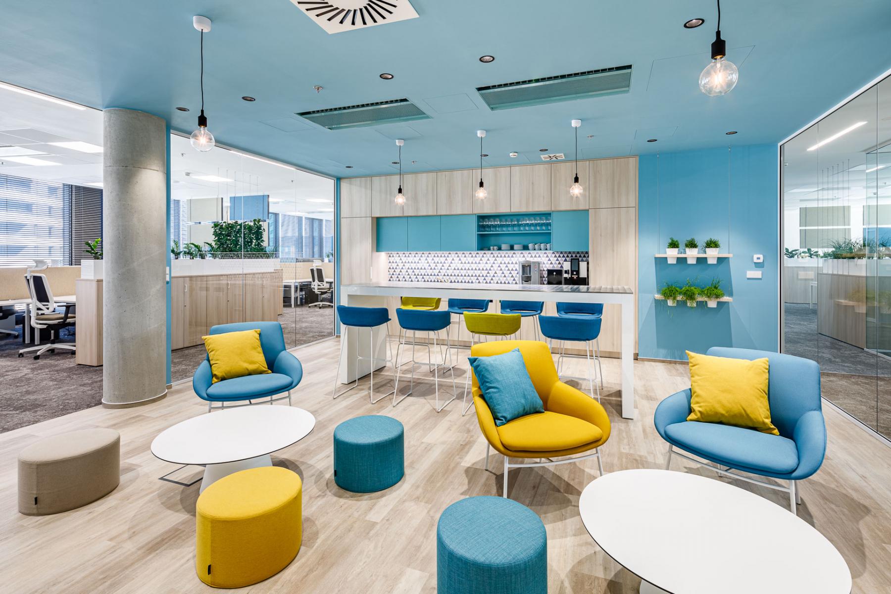
Agile workplaces where flexibility is prioritized need strong, vibrant colours to kick-start employee creativity. Places designed for long-term concentration will appreciate more muted colours. However, the selection of a certain colour alone is not enough to create the desired atmosphere in the space. It is also necessary to think carefully about the lighting and layout of other elements in the interior.
Colour combinations can completely change how we perceive a space. It is therefore necessary to pay close attention to how the individual elements (including, for example, furniture) match each other. In addition to the aesthetic point of view, the practicality of the colour combination is also important, especially when it comes to markings on the walls. There, it is necessary to choose highly contrasting pairs of colours that will help people, especially those with visual problems, easily orient themselves in the space.
Learn more at https://www.capexus.cz/en/blog/colour-trends-in-2021.


